Custom Components
In Raber, you have the flexibility to build pages and add functionality using your own components.
Here are two examples of custom components that can be used in Raber:
Because this document was created using Raber, you can easily access the custom components mentioned above in the Raber editor.
Simply open the page in the editor, and you will find these components listed in the Component Panel:

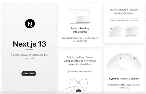
For better teaching purposes, we will learn from the ShowcaseCard, below are three of them:


(You can edit this page, but your changes are not going to be saved.)
Let's dive into the source code of ShowcaseCard:
import { A, Comp, Div, H3, useString } from '@raber/react';
import React, { useState } from 'react';
import { Image } from '../core/components/image';

export const ShowcaseCard = Comp(() => {
  const [isHovered, setIsHovered] = useState(false);

  const title = useString({
    default: 'Raber Official',
    key: 'title',
    uiConfig: {
      widget: 'input',
      label: 'title',
    }
  });

  const onlineUrl = useString({
    default: 'https://www.google.com',
    key: 'onlineUrl',
    uiConfig: {
      widget: 'input',
      label: 'Online Url',
    }
  });

  const imageSrc = useString({
    default: '',
    key: 'imageSrc',
    uiConfig: {
      widget: 'input',
      label: 'Image Src',
    }
  });

  return (
    <div
      className="relative rounded-lg overflow-hidden shadow-lg bg-white"
      onMouseEnter={() => setIsHovered(true)}
      onMouseLeave={() => setIsHovered(false)}
    >
      <Image className="w-full" src={imageSrc} alt="" />
      <div
        className={`absolute inset-0 bg-gray-800 bg-opacity-25 transition-opacity ${isHovered ? 'opacity-100' : 'opacity-0'
          }`}
      ></div>
      {isHovered && (
        <div className="absolute inset-0 flex items-center justify-center">
          <Div vKey="overlay" className="flex flex-col items-center space-y-8">
            <H3 vKey="overlay_title" className="p-4 text-lg font-medium text-white">{title}</H3>
            <A
              vKey="overlay_visite"
              target={'_blank'}
              href={onlineUrl}
              className="inline-flex items-center px-4 py-2 border border-transparent text-base font-medium rounded-md shadow-sm text-white bg-blue-500 hover:bg-blue-600"
            >
              Visite
            </A>
            <A
              vKey="overlay_edit"
              target={'_blank'}
              href={`https://www.raber.app/editor?iframeUrl=${encodeURIComponent(onlineUrl)}`}
              className="inline-flex items-center px-4 py-2 border border-transparent text-base font-medium rounded-md shadow-sm text-white bg-blue-500 hover:bg-blue-600"
            >
              Edit
            </A>
          </Div>
        </div>
      )}
    </div>
  );
}, {
  category: 'Raber',
  name: 'ShowcaseCard'
})
Compared to normal components, it differs in three ways:
- It's wrapped by the
Compfunction - Make it show up in component panel. - It calls the
useStringhooks. - Make properties configurable within the editor. - It uses Visual HTML:
Div,H3,A, etc. - This allows you to directly configure the style of the internal DOM element.
We will cover the first two topics in this article: Comp and Visual Props,you can learn more about Visual HTML here.
Register your component
To ensure that your custom component appears in the Component Panel, simply wrap it with the Comp function that is exported by the Raber SDK. Additionally, be sure to pass the meta information about the component as the second parameter:
{
  category: 'Raber',
  name: 'ShowcaseCard',
  description: 'Showcase Card for Raber Official',
  iconUrl: 'https://www.raber.app/icon.svg',
}
By following the steps outlined above, your custom component will appear in the Category with the icon, name, and description that you have specified:

Please note that the name of your custom component (in this case, ShowcaseCard) serves as a unique identifier that Raber uses to recognize the component. Therefore, if the name is already being used as an identifier, it is important not to change it.
Finally, before using your custom component in a page, ensure that the page has already imported the component.

Please note that if the custom component is not properly imported or loaded into the page, it will not appear.
Visual Props
When you open the Properties Panel for a component, you will be able to view and interact with various form fields that are associated with the component:

Three fields are title , Online Url , Image Src , we call them Visual Props, you can find them in the source code:
  const title = useString({
    default: 'Raber Official',
    key: 'title',
    uiConfig: {
      widget: 'input',
      label: 'title',
    }
  });

  const onlineUrl = useString({
    default: 'https://www.google.com',
    key: 'onlineUrl',
    uiConfig: {
      widget: 'input',
      label: 'Online Url',
    }
  });

  const imageSrc = useString({
    default: '',
    key: 'imageSrc',
    uiConfig: {
      widget: 'input',
      label: 'Image Src',
    }
  });
If you want to make certain string variables configurable in the editor, you can use the useString function to retrieve and consume them. You can choose from four different widgets for inputting string variables:
- input
- textarea
- select
- richtext
You can choose the widget that best suits your needs for inputting string variables.
It's important to note that the key for each prop should be a unique identifier within the component, so it's important not to change it if it's already in use.
In addition to useString, there are also other types of variables that can be configured using the Raber editor.
useNumberuseBoolean
Box
The Box component is a special component that creates a 'Slot' in your component where you can drag and drop another component.
This feature is particularly useful when you want to create containers that have dynamic content. By using the Box component, you can easily customize the content of the container without having to modify the container component itself.
For example,
The card on the left side of the page has a 3D rotation effect that can only be implemented using code, which requires a custom component.
In this case, the card is used primarily as a container with the 3D effect applied, and the content within the card should be dynamic. To achieve this, you can create a custom component and use the Box component to create a slot where dynamic content can be inserted.
export const NextJSCard = Comp(() => {
  const { cardRef, handleMouseMove, handleMouseLeave } = useCard();

  return (
    <div style={{ height: '100%'}} ref={cardRef} onClick={handleMouseMove} onMouseLeave={handleMouseLeave}>
      <Box name='main' style={{ height: '100%' }}></Box>
    </div>
  );
}, {
    name: 'NextJSCard',
    category: 'nextjs'
});
To create a slot for dynamic content within the card component, you can add the Box component inside the component. This will create a slot inside the card where you can drag and drop other components.
You can find the code here.
You can add multiple Box components inside a single custom component. To differentiate between them, you must specify them by the name prop.
Congratulations!
You just learned how to use your own component, this will unleash the power of Raber and enable you to implement any page you want!
Lessons you may want to learn next:
📚 Learning how to use Visual HTML to fully customize the styling of your components.